
Practical design of the bathroom involves not only filling it with functional sanitary ware, but also selecting tiles for wall and floor cladding. It is important to know: how to choose a colored tile, which shade options are successfully combined. Understand that it is better not to combine so as not to overload the room. A harmoniously selected palette of cladding material creates optimal comfort.
Content
Color Matching - General Rules
The color of the finish affects the visual perception of the size of the room. The simplest option to increase the space is milk or cold white squares of glazed tiles, combined into a single canvas. But it is so standard that it causes boredom or association with a medical facility. Rectangular or multifaceted tile fragments are more interesting - with their help, you can vary the volumes as desired:


- horizontal layout gives spatial expansion;
- vertical styling - adds height.
These are general properties of gradation of space. But there are nuances. So, in order to “raise” the ceiling, it is worth adding to the background tile of calm shades on the wall that opposite the entrance, a contrasting or two or three tones brighter vertical guide (for example, along a soft milky beige field, run up a row of two coffee-colored tiles with milk or chocolate). The same effect will be if, on one of the walls, contrastively lined, lay out closer to the ceiling a decorative ornamental "border" of polyhedrons.
But the horizontal brightened strip in the middle - will expand the bathroom. The classic version is a dark bottom (a third of the wall space) and in the same range, but several shades lighter, the top also adds space. But this is too commonplace. And if you combine not the usual two, but three types of tiles: combined tones of the main color and vertical and horizontal stripes, columns of different widths with a print - the bathtub will sparkle. Even more interesting is the option: a thin strip, consonant in tone with the bottom - under the ceiling, a border with an ornament in the middle.
Most manufacturers produce in one line two basic colors for competent compositions. But there are those who also offer a consistent decor. So, at Impulse - a series of colored tiles with a trimmed edge (rectified - seamless) allows you to create a balanced composition. And the size of the tile is combined - everything is ready for installation, nothing needs to be customized.
Color play in a small room
The compact size of the area, combined bathroom dictate additional rules for choosing the facing material. First of all, you need to abandon the large-sized tiles - the seams will crush the space, overshadowing the overall background. The ratification of small and medium sizes is a universal option for a compact bathroom.
Refuse gloss, glaze or minimize them as much as possible. Glare will narrow the dimensions, give the interior a low price. The exception is marble imitation. But the matte or mirror texture will ennoble it.
 You may be interested in:
Large patterns are not suitable enough - they compact the space, creating a pressing, depressing impression. Naturalness, pure shades of color - the basis of a successful solution:
- creamy chocolate and coffee tones will add depth (especially if you enclose the shower with a glass partition);
- a combination of beige and green (stripe) - it will refresh and spread the walls;
- cream palette - from the color of sweet toffee, a little browned meringue, to the color of the ripened crust of the finished pie - an elegant, self-sufficient option of comfort and warmth;
- sunny honey with golden yellow additives - space and chic;
- combination with gray, its midtones - the full scope and mass of mix options: with silver or light blue + air and freshness, with green and light green + calm and expanse, with orange or scarlet + free and tone up;
- black and white contrast with the predominance of light (dark - decorated elements in rows or episodically) - grace.
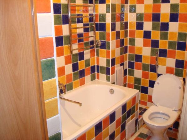
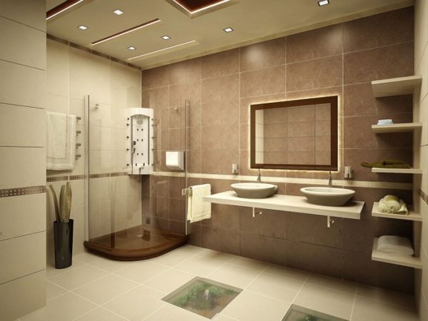
The multicolor of large areas
A large bathroom is a mass of possibilities. There are practically no restrictions on the choice of color - everything that suits the owner of the room will do. By analyzing suitable combinations, we can single out the top five techniques for applying and mixing colors.
- Elite interior - black background with various shades of silver and gold. Chic - a breakdown of a continuous field with red stripes and an ornamental panel.
- Multiple combination - red or saturated burgundy, white, gray, black, metallic. Borders, mosaic - everything will do.
- The arrangement of white with orange and deep beige, peach.
- Mosaic colors of spring grass, saturated green, white and emerald.
- Gray and pink or romantic beige with gold.
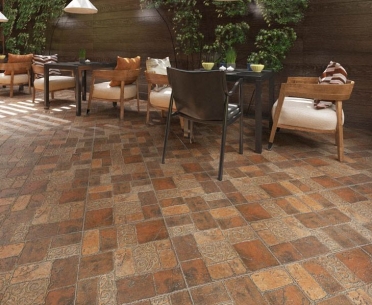
Country Style Bathroom
When designing a bathroom, in addition to dimensions, the chosen style also matters. For those who choose rustic motifs, country is a good choice. It combines simplicity, naturalness and skillful imitation of antiquity.
The best way is to finish it with textured lining under natural stone (fragmentary or on the floor), brick or pick up tiles in pastel shades. Soulful "primitivism" does not accept abstractions, hard broken lines and bright contrasts.
 You may be interested in:
Loft - profitable brutal
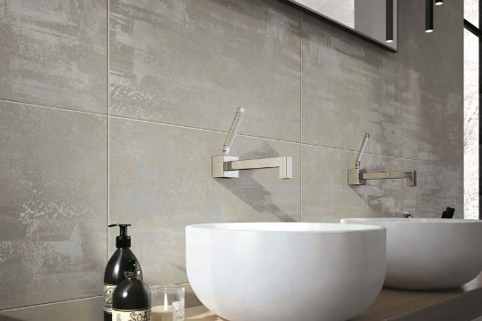
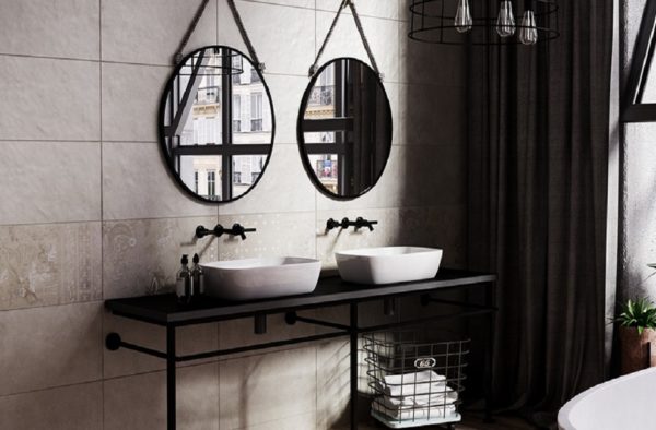
For those who do not tolerate conservatism - a loft. Get out of the ordinary, hello correct shapes and natural shades. Tile for shabby concrete - porous, smooth, shabby metal with rust and stains corroded by corrosion. It looks good mosaic, repeating the chess of workers' shops.
Preferred are large tiles and grout of gray - cement color. The material of different textures and “breeds” is organically combined: light gray concrete and light yellow, time-bleached wood. If the dark color prevails, cherry-chestnut brown is perfectly adjacent to it.
Tender provence
Light luxury is a characteristic of style with French roots. Favorable design variation in a room with a window or modest dimensions. Tiles of the most light palette with pastel accents of decor are selected. As an option - delicate (with the transition to white) pink and blue.
Favorable variety of style interior - contrasting tandems. The milky or creamy white lining and purple-pink, fuchsia or indigo mosaic panels look elegant.
Spectacular Art Nouveau
If the priority is the English nobility, interwoven simultaneously with pathos and simplicity - the sophistication of modernity will do. In this style, a mix of multilevel colors, lines, shapes and tonal saturation is permissible. The main thing is no fading.
 You may be interested in:
You can play with contrasting backgrounds and a monotonous palette. Golden-sand walls and brown-chocolate floors look harmonious. Sandy gray stripes. Ash mosaic and aquamarine exhibitions. Pink-clove episodes on a beige-caramel background.
Successful selection and color combination of tiles will not only decorate the interior, but also solve many problems with construction flaws (wall irregularities), spatial compaction, stretching, expansion. The main thing is a thoughtful layout, high-quality tile. And, of course, creativity is the implementation of our own projects.
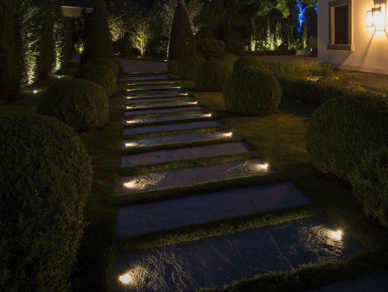 How to decorate and highlight garden paths in an original way?
 How to grow Kombucha "from scratch"?
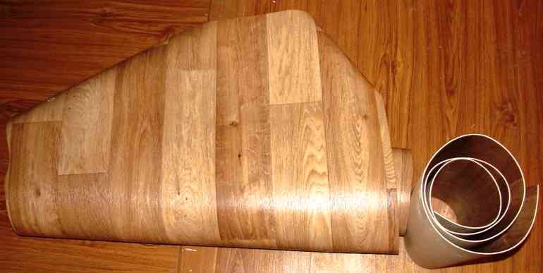 8 practical ideas for using linoleum in the garden
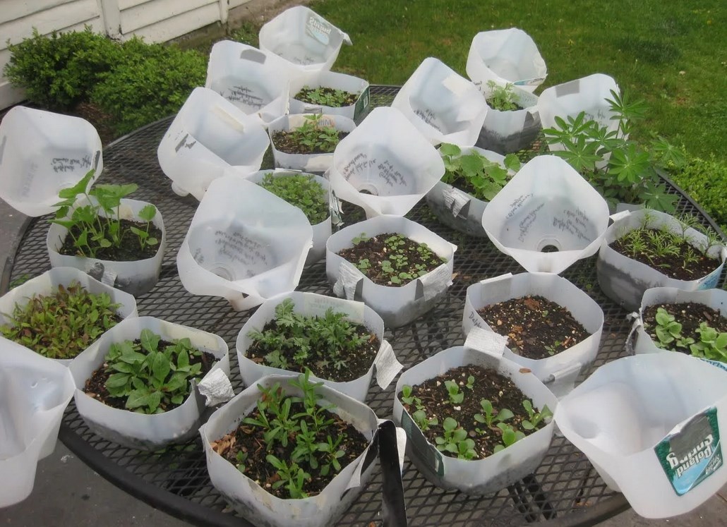 Useful crafts from do-it-yourself canisters for the garden